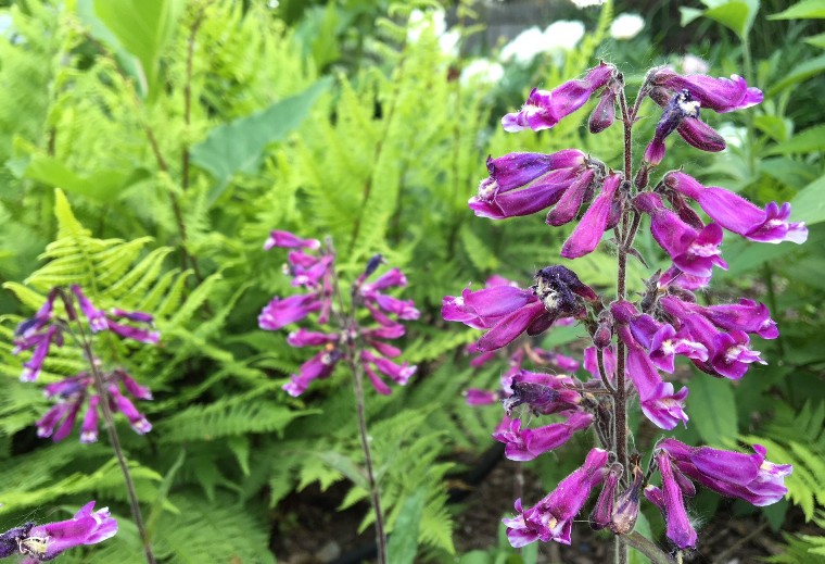
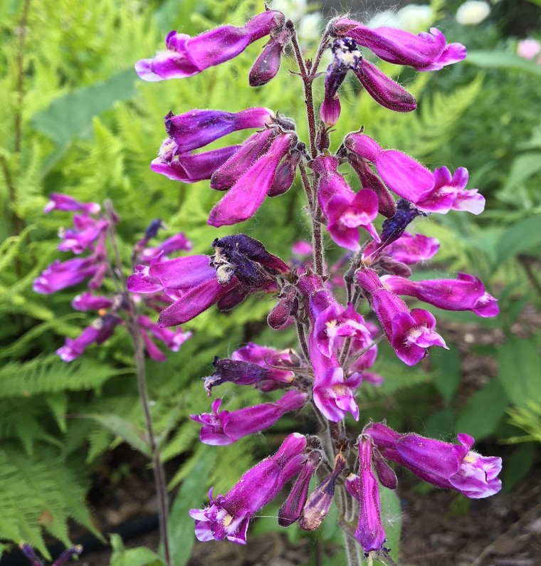
Truth be told, I’m not a big fan of this penstemon plant that I put into the perennial bed last year. I was much more looking forward to the coreopsis that was next to it, but of course that one didn’t make it through the winter, and so we are left with this straggly thing that looks better in photos than it does in real life. If you examine it closely, you can see its messy nature: the faded flowers stick to the same stem on which new blooms are borne, lending it an unkempt feel. I’m a notorious Virgo, and that’s extremely troublesome to me.
Less troublesome, and the reason why I haven’t excised it to the hidden side yard yet, is the coloring. It’s a gorgeous hue somewhere between fuchsia and purple, and it gets set off brilliantly by a backing of lady ferns currently in their early-season chartreuse shading. That combination alone sets off fireworks, and saved this little penstemon for the moment.
(Word of warning: I’m not promising anything when the flowers fade for good, so enjoy this moment while it lasts.)