“In my leisure time I appear rather… impractical. But I do think that I’ve made a practical woman out of myself. You can’t have worked the number of years I have, through hell or high water, without being basically practical” – Diana Vreeland
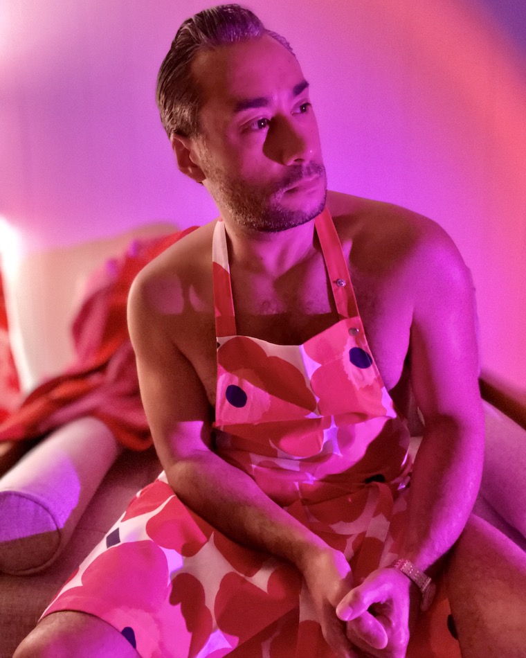
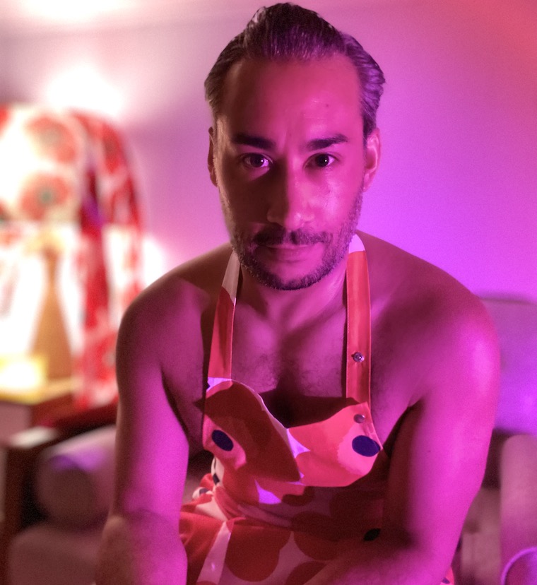
The sales clerk trying to sell me on this Marimekko apron was being utterly adorable. She saw me eyeing it and picking it up, then sauntered over and said what a beautiful piece it was. “You could wear it even as a part of an outfit, over some jeans or something,” she said.
“Or nothing at all!” I excitedly exclaimed. How little did she know me. “You know, for a party.”
“Oh I can totally see you just in that, with a glass of wine, just hanging out,” her associate chimed in. He seemed to have a better read on what I might wear and how.
And so, for those two Marimekko sales people, who brightened the rainy day that Suzie and I were battling on our recent trip to Manchester, I give you this look: nude but for an apron. I simply followed this sage advice from Ace of Base: don’t turn around.
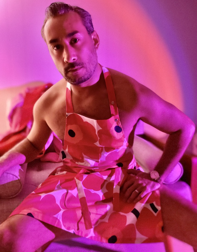
The coloring of the apron is a bright and plucky homage to Diana Vreeland, who seemed to adore only certain super-saturated shades of scarlet, as evidenced by her red drawing room in New York if I remember correctly. Her vibrant exuberance very much inspired this fall’s strong color palette. We needed the lift.
“All my life I’ve pursued the perfect red. I can never get painters to mix it for me. It’s exactly as if I’d said, ‘I want rococo with a spot of Gothic in it and a bit of Buddhist temple’- they have no idea what I’m talking about. About the best red is to copy the color of a child’s cap in any Renaissance portrait.” ~ Diana Vreeland